Playing With Tattoo Elements By Manipulating Lights and Darks - Jake Meeks Fireside Tattoo Network
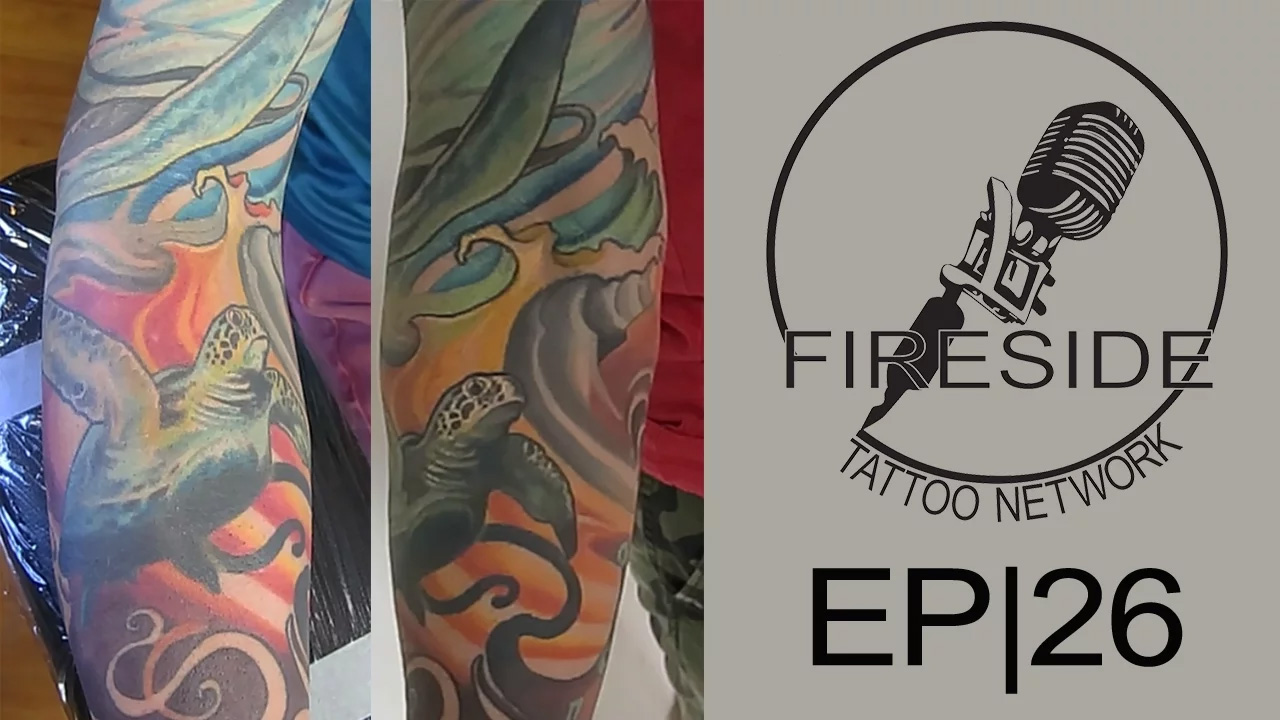
Playing With Tattoo Elements By Manipulating Lights and Darks
“I’m coming back with my lightest lights, and putting them in the light side of the turtle just to push that contrast and create texture to kind of pull that head forward a little bit.”
- Jake Meeks
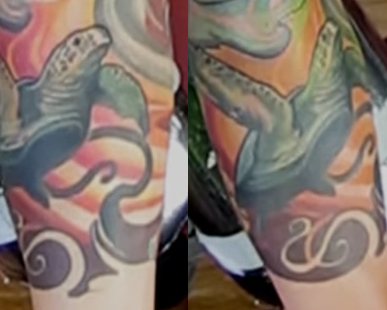
Let’s talk about temperature for a little bit. How it generally works is warm colors push out or forwards towards the viewer and cool colors recede back. So what’s going on in the tattoo above is the warmth of the background is grabbing more attention than the foreground subject.
A little trick you can use is blending in a cooler version of that warm tone to sort of dampen and push that warm background away from the subject. Conversely adding in some warmer versions of the cool colors in the foreground can really help to pull that subject matter up front.
A couple other ideas to neutralize a strong color is by adding in a little bit of the complimentary of that color. So if you have a really warm red, adding in a little bit of green can help to gray that out a little and drive more attention towards the subject. You can also add in some brighter highlight areas to the cool foreground to help trail the eye even more.
Watch the full episode:
Tattoo Techniques: Covering Dark Ink With Light Fireside Technique EP 26
Tattoo Resources from Beginner to Advanced
No matter where you are in your tattooing career the Fireside Tattoo Network provides resources and information that have helped hundreds of tattoo artists.
Are you just starting out in your tattoo journey? Maybe you've been at it for a while and didn't have a traditional tattoo apprenticeship? Fireside has courses and programs for anyone who's hungry for information and wants to level up their tattoo design skills.
The Fireside Method:
Check out a few of our interviews with tattoo artists and Deep Dive articles:
- Illustrative Tattooing with Nick Baxter
- Controlling the Tattoo Consultation
- Testosterone for your Tattoo Power Supply
Still interested, need more!? Check out our Full Podcast Episodes HERE!
Recent News
Inside Fireside: Mentality, Pain Management, and the Art of Client Care with Kurt Jacobson
- 09/06/24
Why Do We Care About Give? - Carson Hill
- 07/24/24